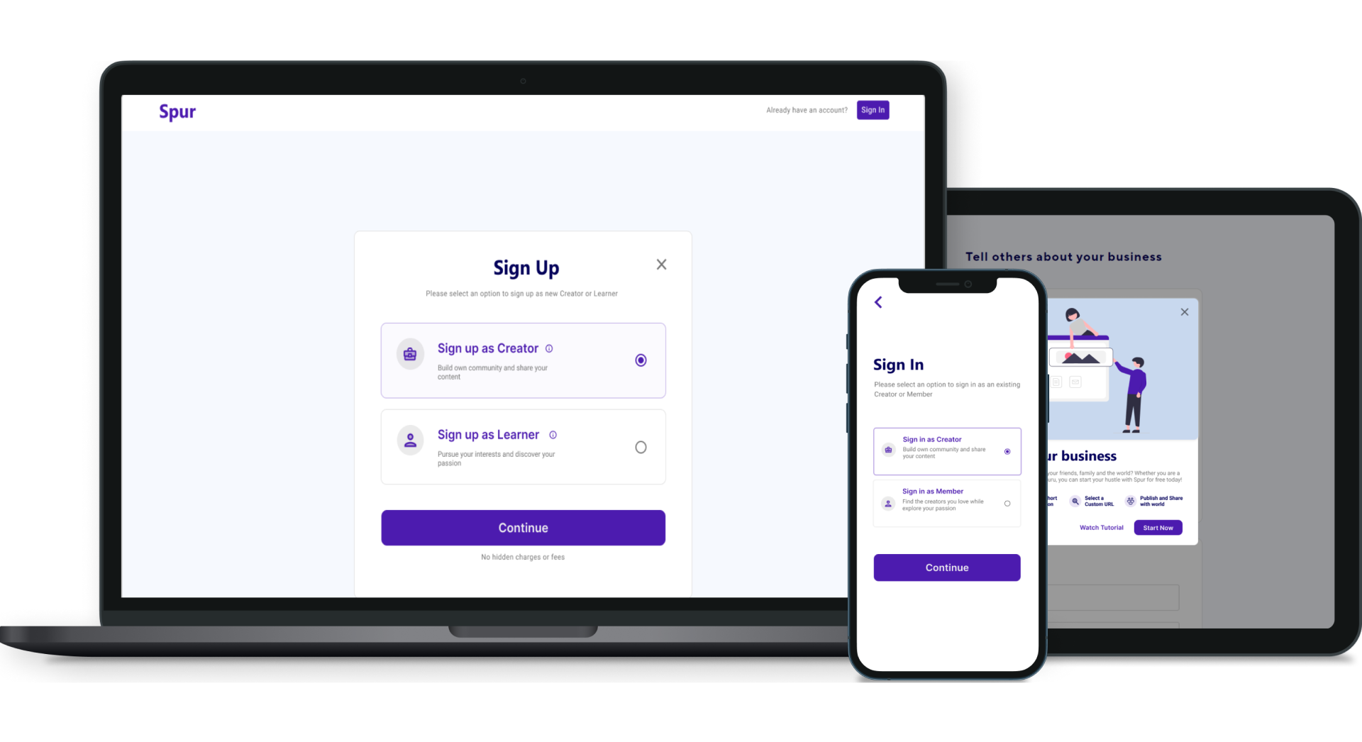
Zighra specializes in behavioral biometrics and AI-driven solutions to enhance privacy and security in digital interactions. My team was focused on building a decentralized content creation platform called Spur to explore this technology and enhance user security and privacy.
Spur aims to empower creators by giving them the space to share their content and services, host events, and connect with like-minded individuals to build a community. The platform also has a strong focus on education, with many creators offering services like tutoring and music lessons.
A long and confusing onboarding journey
Spur's original onboarding flow was severely broken. The team initiated a redesign because of three existing problems in the interface.
- 01 User type uncertainty during onboarding New users didn't know which user type they identified with. They misidentified themselves, which led to a stream of complaints and a high drop-off rate at onboarding.
- 02 Vague user-type terminology The two main user types were called “Business” (Creator) and “User” (Learner). The terminology was vague and inconsistent.
- 03 Difficulty reaching the sign up page The Creator sign-up page was intertwined with the rest of the sign-in flow.
Distinct user categories
New users faced confusion deciding whether to sign up as a “Creator” or a “Learner.” An example of a Creator is a teacher, whereas a Learner represents a student. The distinction between these two account types was not clear. To gain insight into both categories, we pinpointed the following proto-personas.
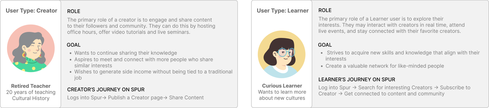
Which gave us the question to design against.
How might we alleviate the confusion between the two user types throughout sign-up?
Project goals
Spur's primary goal in the new user onboarding is to enhance user comprehension during sign-up. To gauge how well the goal is met in the new design, we assessed the success rate of three tasks.
- 01Navigate from landing page to sign upCan new and existing users successfully reach the Sign Up / Log In page?
- 02Select the desired user typeCan new users correctly identify themselves between a Creator and a Learner?
- 03Complete the sign up / log in formCan new and existing users complete the flow all the way through?
Understanding the broken flow
The original onboarding page is shown below, with the main friction points that contributed to the broken flow annotated.
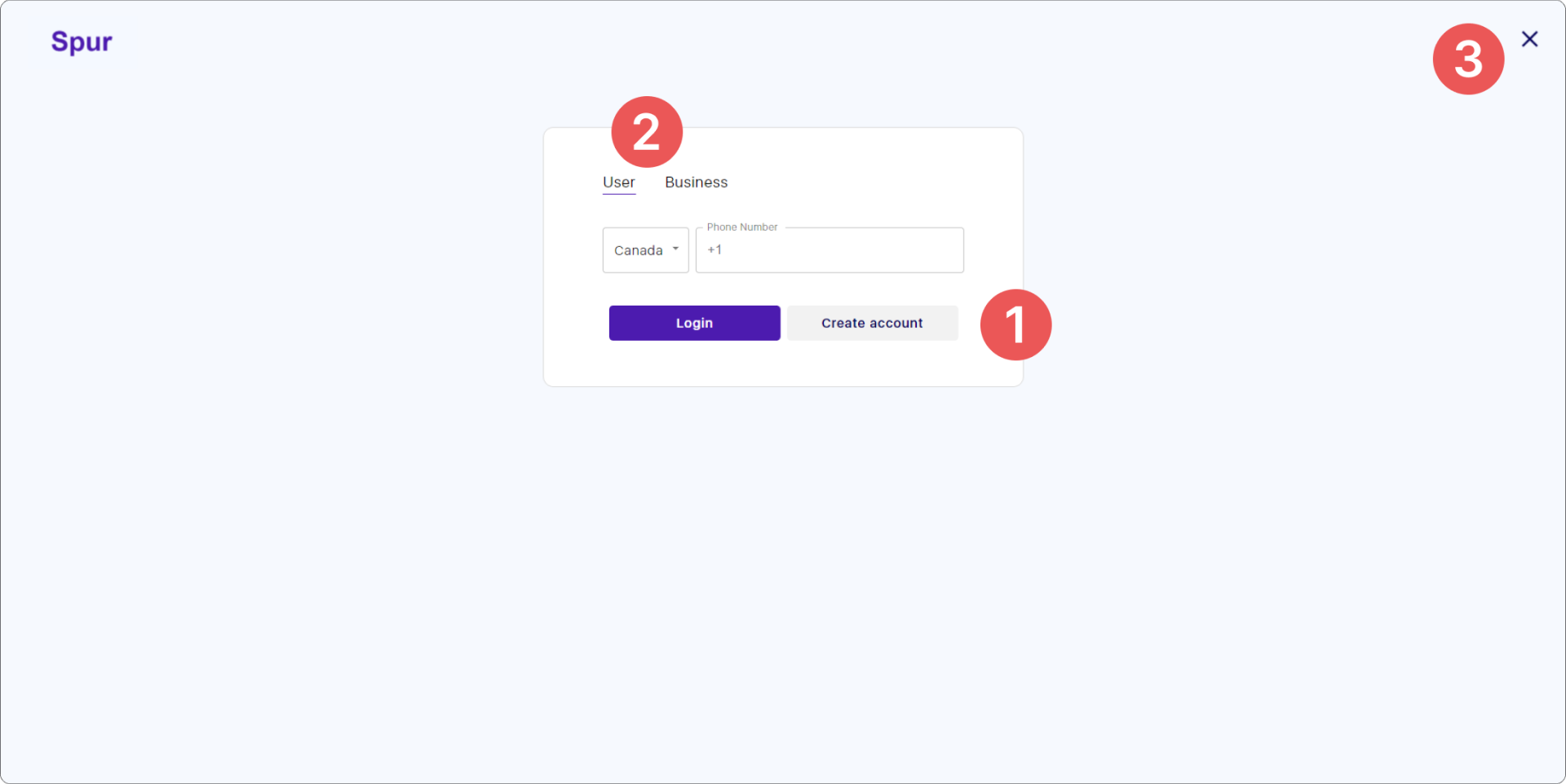
- 01 Account creation is not the primary action To create an account, a registrant first had to navigate to the “user” tab and then click “create an account,” which was not the primary action on the page. Using both Login and Create account as primary and secondary caused confusion.
- 02 Terminology without context The “user” and “business” types were shown with no context, definition or examples.
- 03 Limited entry points An opportunity to increase entry points by incorporating sign-up routes from the login page.
The heat map showed where users were clicking on the current login page and how frequently areas of the page were visited. It validated the team's assumption that people were confusing the two user types.
Despite having significantly more business/creator users than user/learner users at this stage, the heat map presented conflicting results. The business/creator user type had 80% fewer clicks than the user/learner type, which raised concerns.
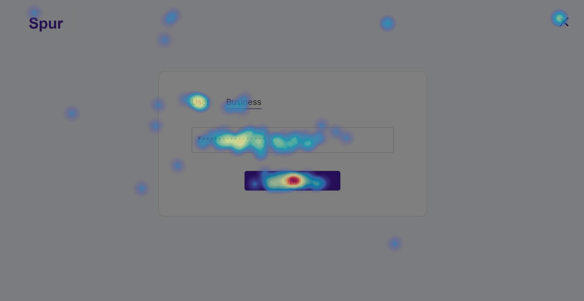
After user testing and research of the user flow, we found that users were unsure whether they were signing up to create and share content or to use and consume it.
Another key finding: in the current design, Learner users had to enter the login flow in order to sign up and create an account, which is a completely unexpected and confusing experience.
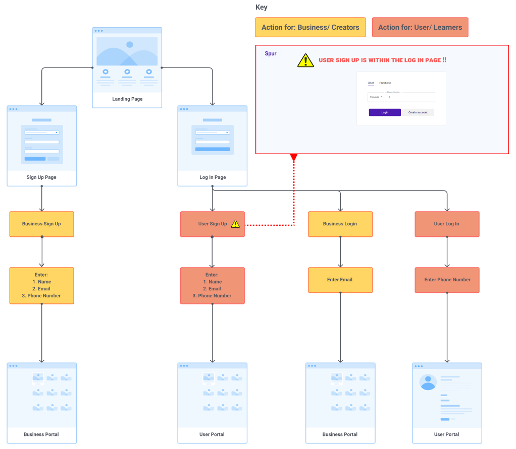
The problem lies in users not knowing what they are signing up for, coupled with the challenging navigation in the current sign-up flow.
Key insight
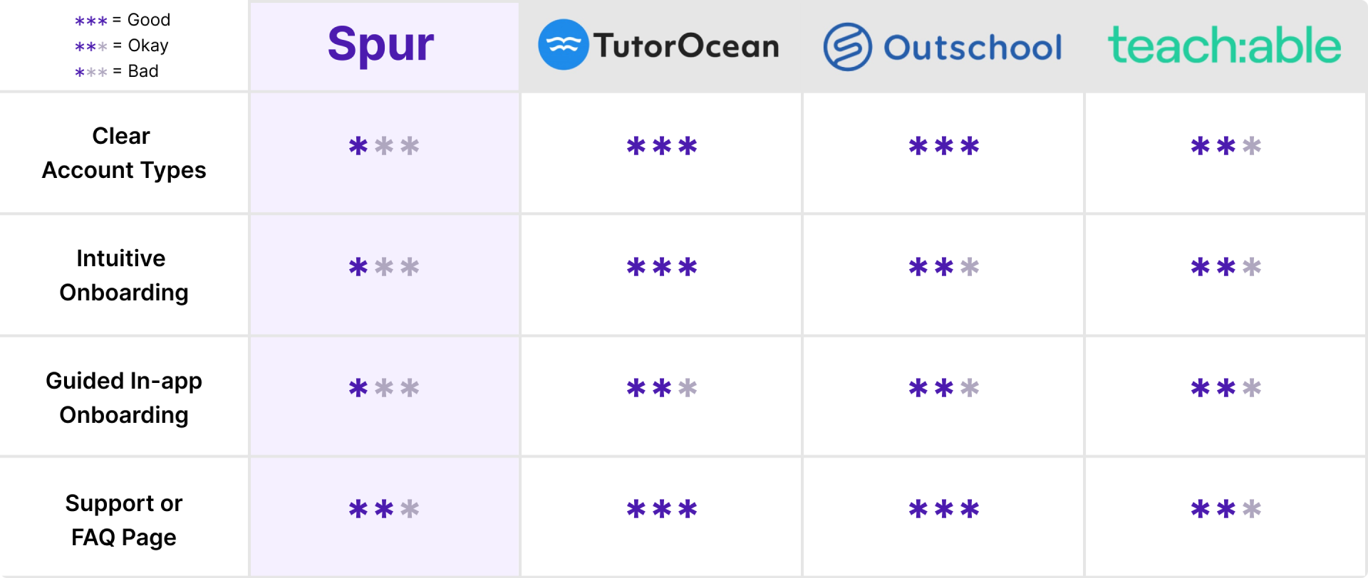
Each company prominently executed a short, quick sign-up flow with enough explanation to prevent confusion. Most platforms also separated the user types from the landing page.
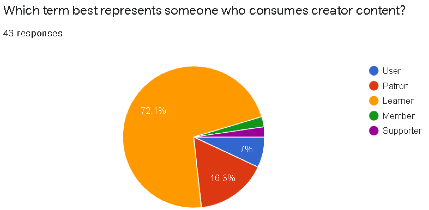
UX writing was not in scope, but the company wanted to test which phrase should replace the overly general term “User.” 72% of active users chose “Learner” over the excessively wide term.
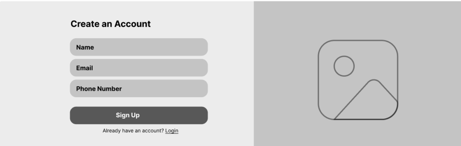
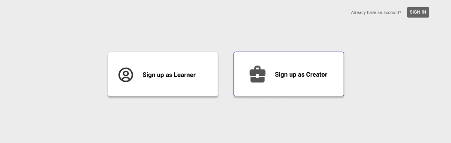
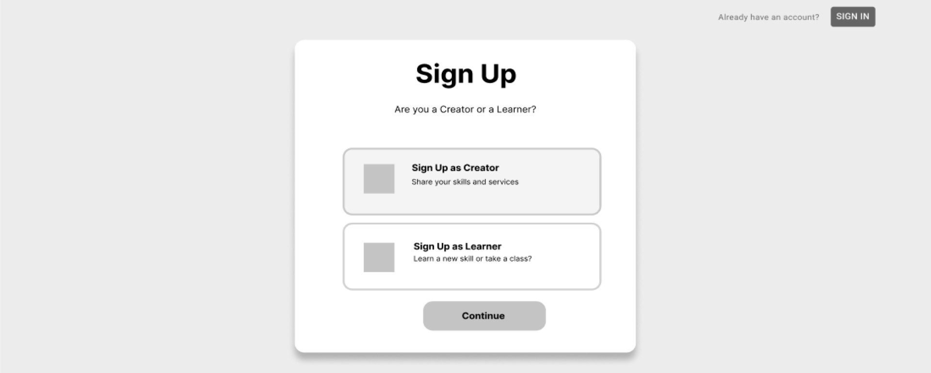
Low-fi wireframe iterations
After specifying the key features that needed to be on the sign-up page, we developed three distinct design ideas to address the problem space, based on the research findings.
Three decisions that fixed the flow
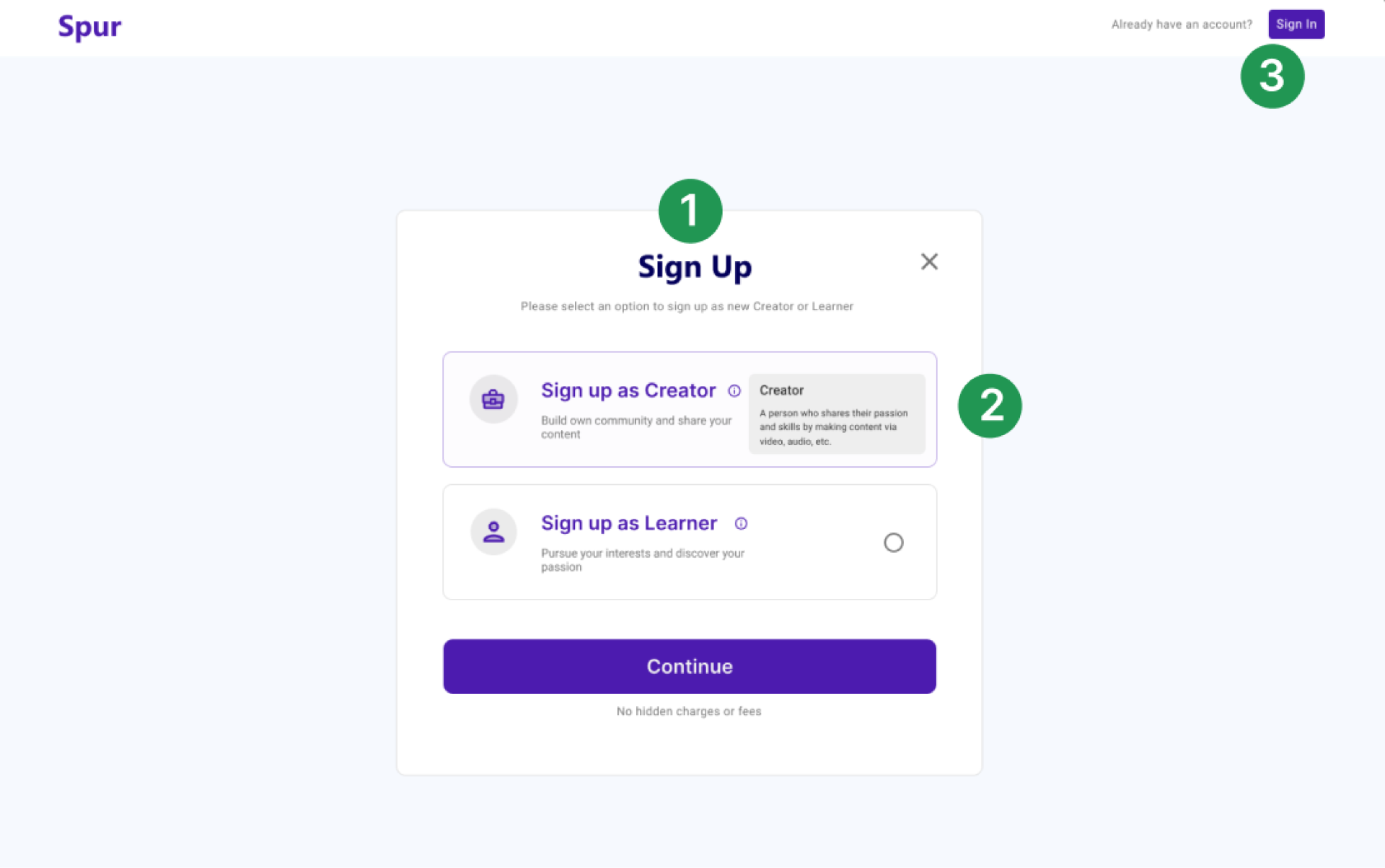
Improve the user flow
- Problem
- Creating an account was buried inside a complicated navigation system, competing with Login for the same visual weight.
- Shipped
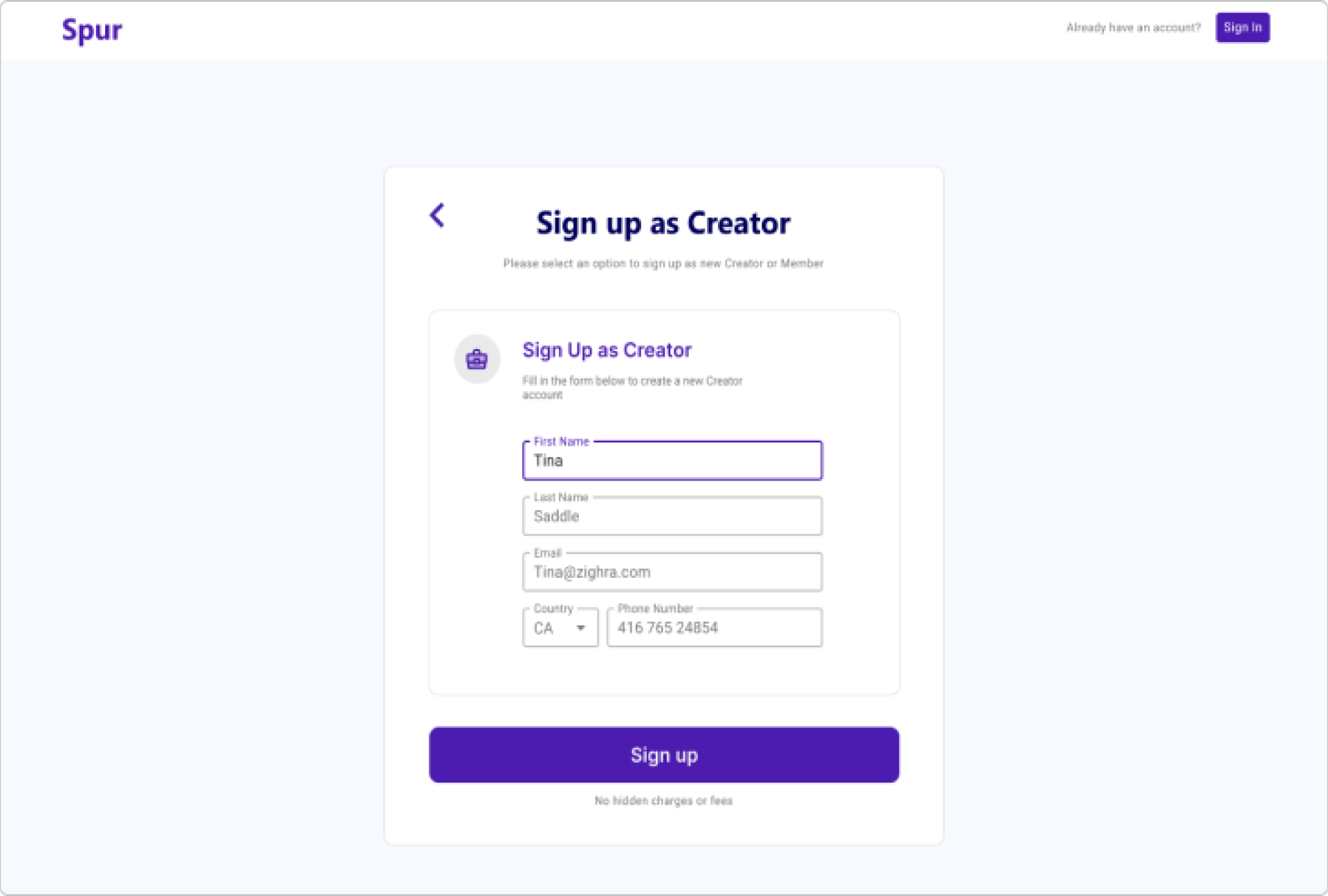
- Account creation split onto its own page, so the important action is visible throughout the whole login and sign-up flow. Separating sign up from sign in streamlined registration and served the onboarding KPI directly.
Provide context
- Problem
- The previous design demanded high mental effort: two user types named without definition, example, or consequence.
- Shipped
- Supporting text, icons, and tooltips that give clearer definitions and examples for each persona, at the moment of choosing.
Increase entry points
- Problem
- The registration interface had no intuitive entry and exit points between its two halves.
- Shipped
- Users can sign in from the sign-up page if they already have an account, and create an account from the login page. These navigation points lift new onboarding conversion for visitors.
Final web and mobile design
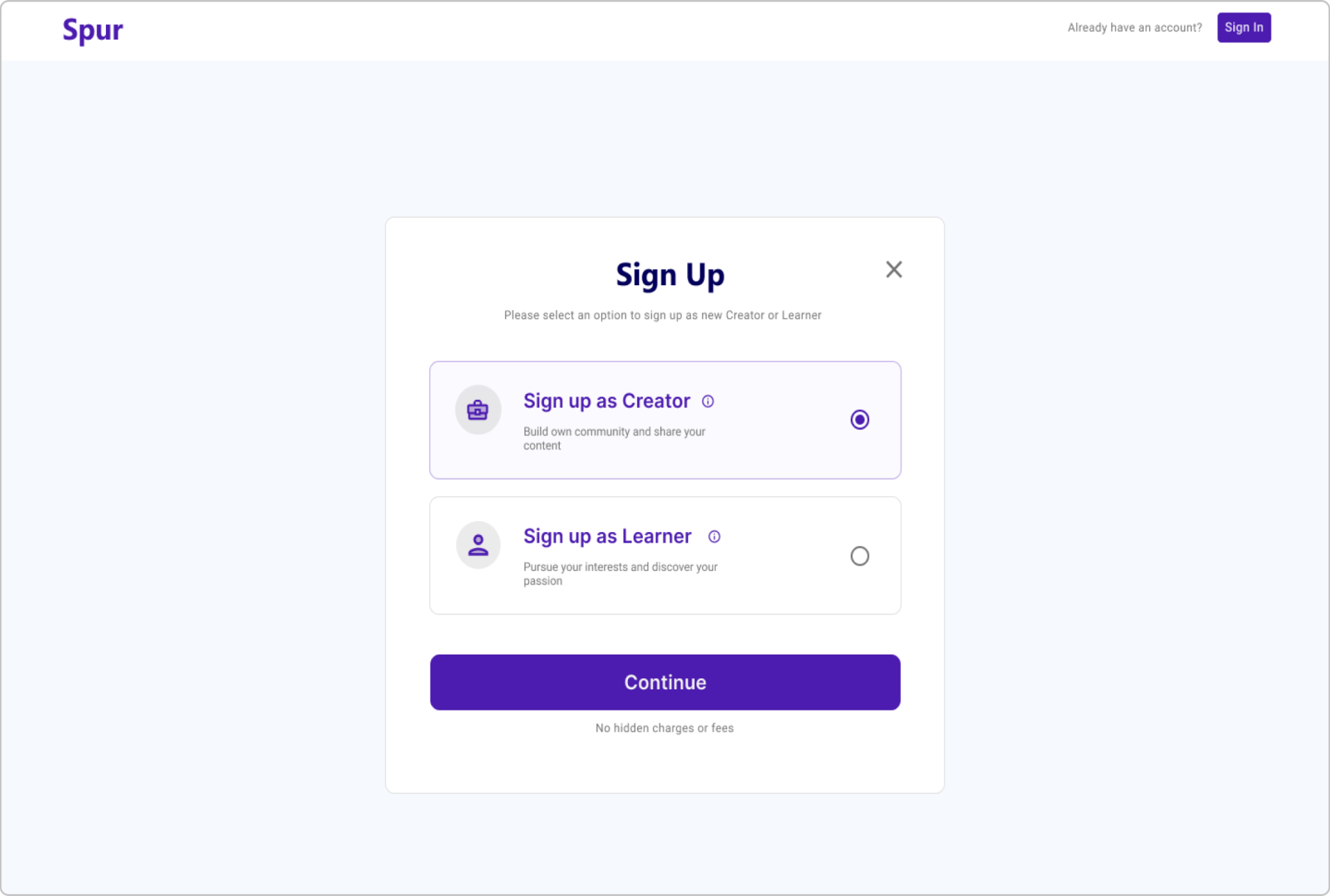
Final mobile design
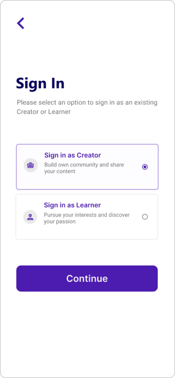

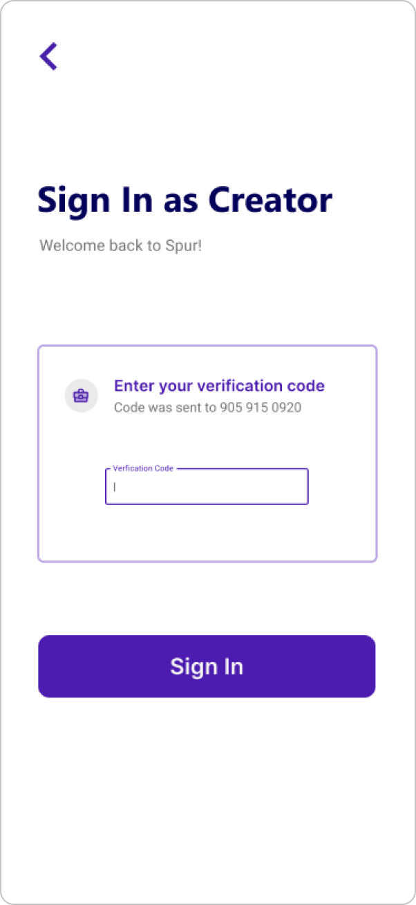
The final mobile design of the registration onboarding flow
Validating the redesign
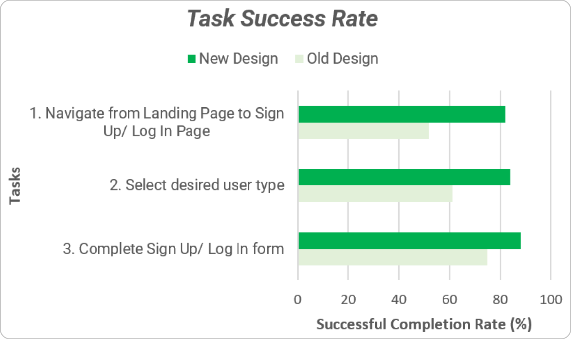
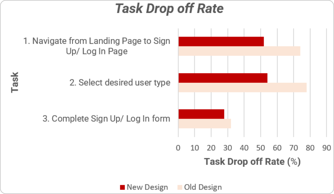
A task-based study assessed the difference in task success rate between the old and the new design. The percentage of users accomplishing each task successfully is recorded as the success rate. The binary study showed a favourable increase across all three tasks.
- Task 01
- +29% — navigate to sign up
- Task 02
- +23% — select the user type
- Task 03
- +13% — complete the flow
Embracing ambiguity
The success of the prototyping and user testing phases created real momentum for prioritizing the onboarding redesign for development. Due to changes in Spur's roadmap, the project was then put on the backlog for the design and development team.
It still taught me a lot about embracing ambiguity, asking the right questions, and building products for a rapidly expanding user base while delivering impact.