Saved per breach, on average, by companies with a tested incident response plan. The single largest cost reducer measured.
IBM — Cost of a Data Breach Report
When ransomware hits, the first hours decide everything. Who gets called. What gets restored first. Where the backups live. Companies with a tested incident response plan answer instantly and contain the breach; companies without one scramble, and breaches that drag past 200 days cost dramatically more.
The stakes have moved past best practice. Cyber insurers now require a completed IR plan, reviewed quarterly, as a condition of coverage. What was a security recommendation is now a recurring obligation for every business, from a ten-person shop to a 500-person enterprise.
Arctic Wolf had a tool for exactly this. Only 30% of surveyed customers had a plan complete enough to use.
The IR Planner was not built at Arctic Wolf. It arrived through an acquisition: a mature product with years of engineering behind it and none of what a mature product usually has. No design system. No accessibility checks. No prior usability research. It had been shipped sprint by sprint by engineering and product, built to function rather than to be used.
I joined as Lead Product Designer when the handover began, the only designer on the migration. The work started with building context on a tool I had not built, and rapport with the product and engineering leads who had, so I could tell which decisions were deliberate and which were inherited.
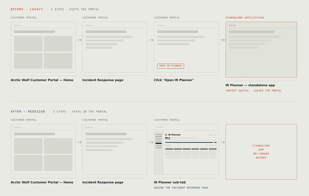
Post-acquisition, the IR Planner was classified as a standalone application. It lived on the legacy portal behind its own login, outside the environment customers actually worked in. Reaching it meant going from the portal home, to the Incident Response page, clicking “Open IR Planner,” and leaving the portal entirely. Four steps and a context switch.
The fragmentation was visible before any research. What it was costing was not.
The assumption on the table was the obvious one. IR planning is tedious. It asks IT teams to document contacts, systems, escalation paths, and recovery order, none of which feels urgent until the day it is the only thing that matters. So people start, stall, and never come back.
If that were the whole story, the fix was a better form. Clearer inputs, smarter defaults, a well-timed nudge.
Before building it, we checked.
We asked customers on the legacy IR Planner whether they had completed their plan and, if not, what was stopping them.
The second most common answer was not “I don't have time.”
“What is the IR Planner?”
28% of surveyed customers did not know the tool existed.
Awareness was the first barrier, not the only one. Among customers who did know about the tool, fewer than half were making real progress. Most had either started and stalled or never begun, and only a handful had actively opted out.
I wrote the protocol and moderated a round of interviews to dig into the survey responses. Customers described what they had been working from before: Word documents, Excel, in some cases handwritten plans.
“Have an external IR plan… Excel doc.”
They also described the IR Planner as less overwhelming than the Excel and PDF templates they had been using. Whatever was stopping people, it was not that the tool compared badly to the alternative.
I ran a usability test of the legacy experience to capture task performance before anything changed, so the redesign could be measured against real numbers rather than assessed on impression.
- 01How might we integrate the IR Planner into the Arctic Wolf customer portal so it becomes a seamless part of the customer's existing workflow?
- 02How might we surface plan completion progress inside the portal so IT security teams discover the IR Planner and know what's left to finish?
The goal was to migrate the acquired tool and blend it into Arctic Wolf's customer-facing product. That meant rebuilding on Arctic Wolf's design system at feature parity with the legacy state.
- Parity
- Nothing inherited could be removed.
- Deadline
- The legacy portal hosting the IR Planner was being sunset. Four months end to end: design complete by the end of October, code complete by the end of November.
- Foundation
- No legacy design system. Every pattern had to be mapped onto Arctic Wolf's from scratch.
- Negotiable
- Inherited functionality was fixed; anything not yet built was still slightly open to question, but the deadline constrained dramatically what new things could be added.
Surfacing the plan where customers already were
- Problem
- Moving the IR Planner into the portal made it reachable, not visible. Someone who did not know the tool existed still had no reason to navigate to Incident Response and find out.
- Decided by
- The survey. This surface did not exist before the research; it was scoped because 28% of respondents had never heard of the tool.
- Shipped
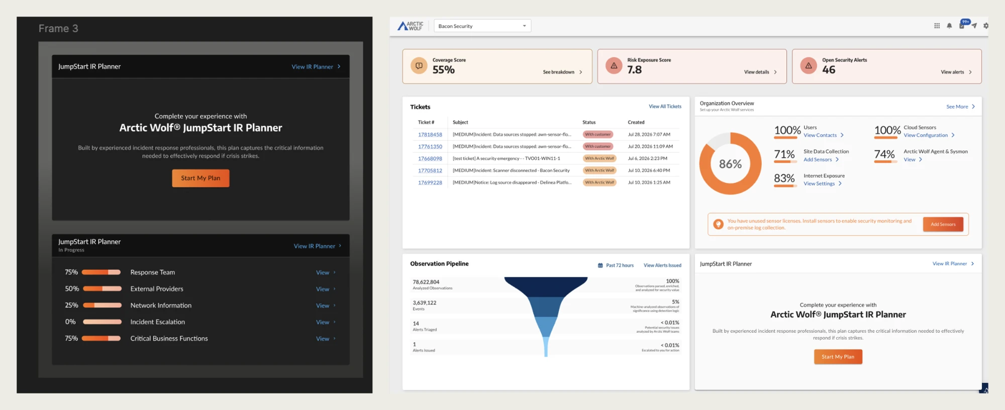
- A plan status widget on the Unified Portal home dashboard and the Incident Response dashboard. Customers who have not started see an introduction and a single action to begin. Customers with a plan underway see a status readout: one row per section, each with its completion percentage and a link straight into it.
- Why two states
- Someone who does not know the tool exists has to be told what it is. Someone mid-plan needs to know what is unfinished. An aggregate figure would only say they were behind; five rows reading 75%, 25%, 0%, 75%, 75% say exactly where.
Making progress visible
- Problem
- The legacy tool tracked completeness card by card, across four states. A user could tell whether any single card was done and never know their position in the plan, because nothing aggregated those states.
- Decided by
- The research. People who stalled were not confused about individual fields; they had no sense of how much was left.
- Shipped
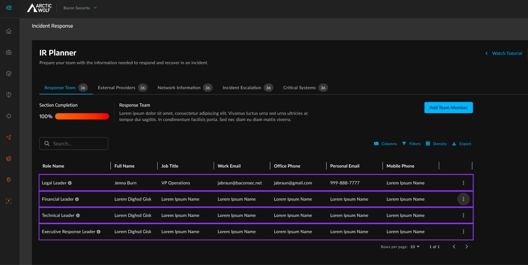
- Completion surfaced at two levels: a section completion percentage above the content, and a count chip on every section tab. Progress is readable without opening anything.
Making entered data visible
- Problem
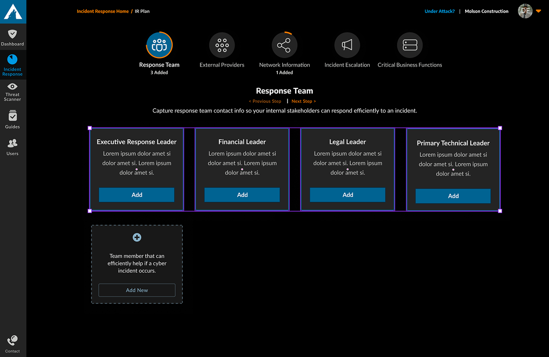
- Legacy roles were cards with an Add button. Entered values stayed hidden inside the card, so a user could not answer “who is my Legal Leader” without clicking.
- Constraint
- Feature parity. I could not cut fields to simplify the view, so the view had to hold all of them.
- Shipped
- A data grid with every field on screen, plus search, column controls, filters, and density settings to manage the width.
- Cost
- The legacy cards carried an always-visible description of each role. In the grid that guidance moved into an info tooltip. Persistent scaffolding became on-demand scaffolding, which serves returning users better and first-time users slightly worse.
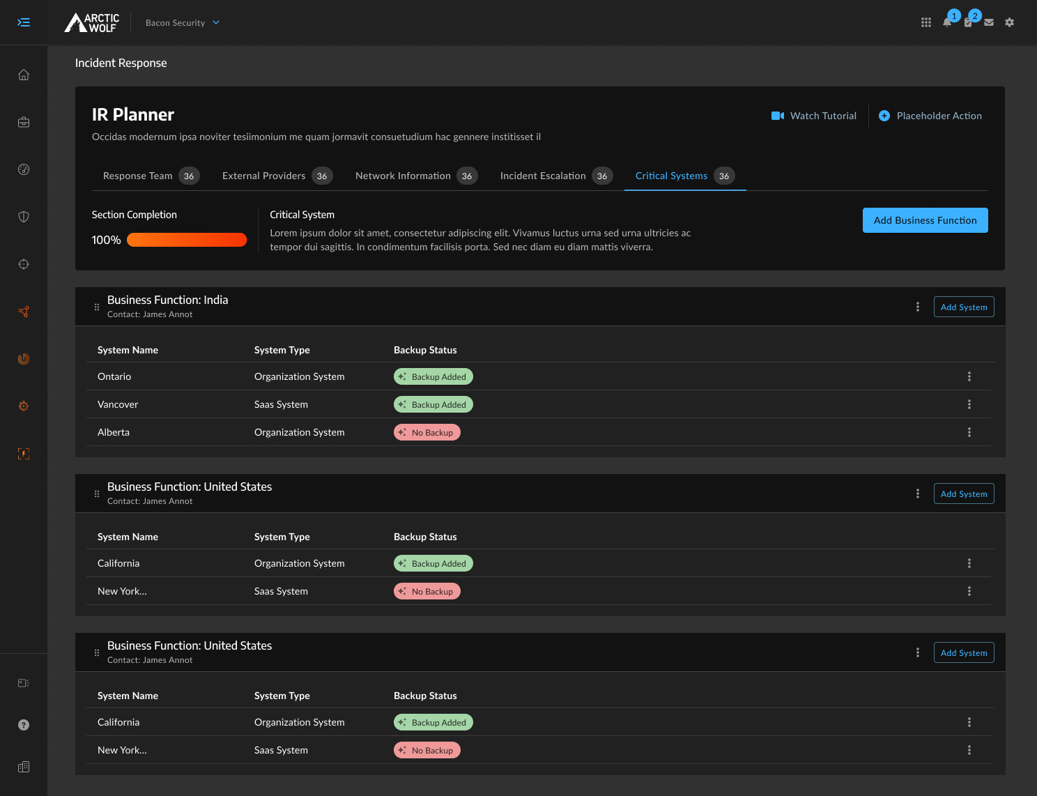
Where role editing lives
- Problem
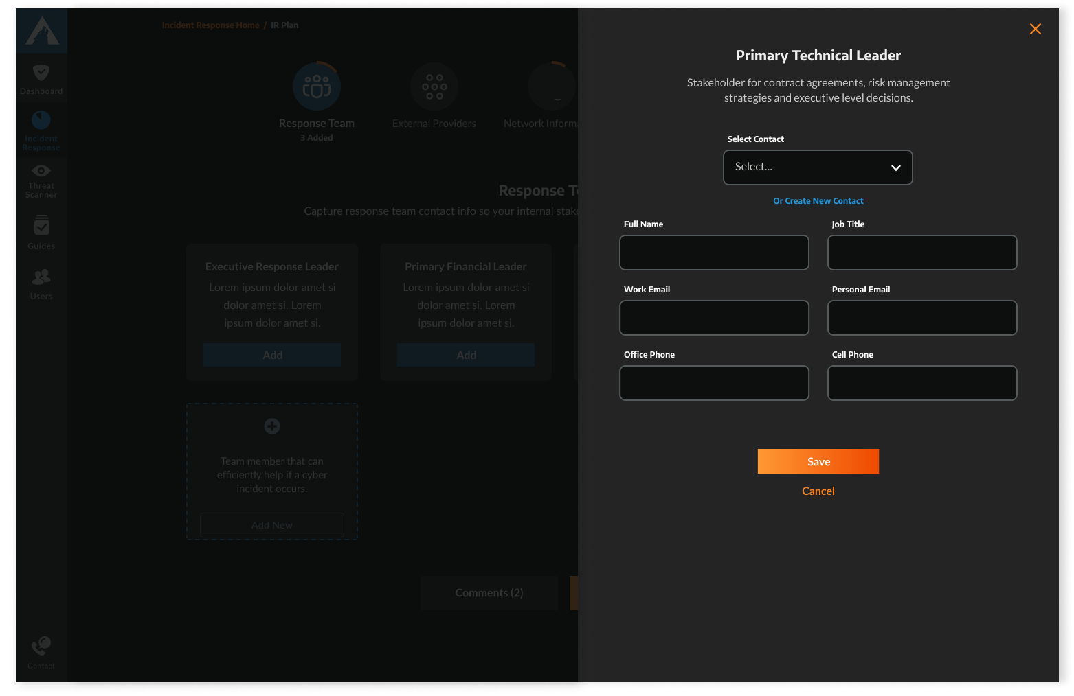
- The legacy tool edited every role in a flyout over the section view. A drawer preserves context, which holds when the edit is short. Several roles carried more than ten fields, so the drawer became a narrow scrolling column with the grid sitting uselessly behind it.
- Decided by
- A threshold rather than a blanket rule: short edits stay in a drawer, anything past a handful of fields gets a dedicated page.
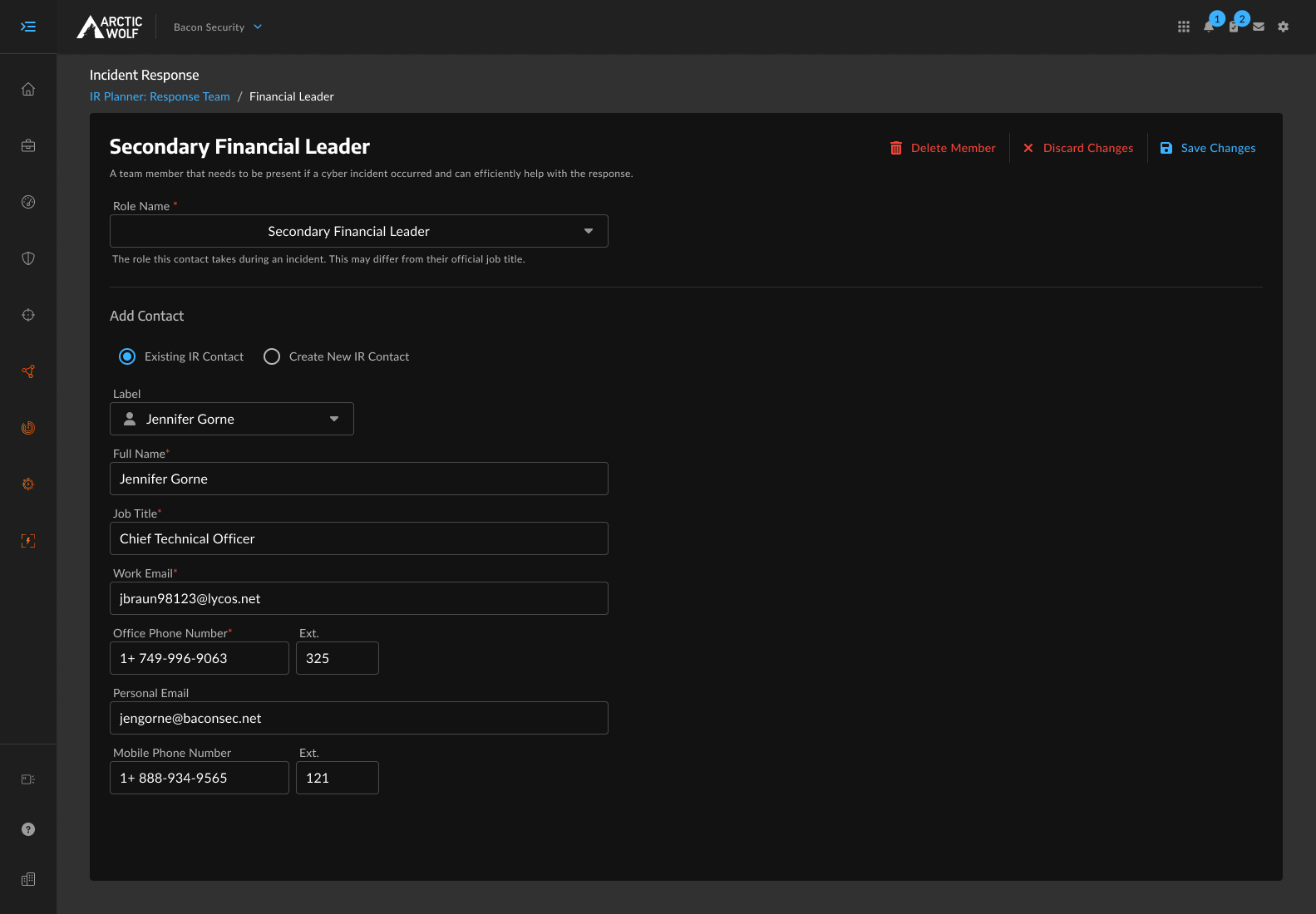
- Shipped
- Role editing on its own page, with a breadcrumb back to the section, read-only as the arrival state so landing there does not mean editing, and an unsaved-changes guard on exit.
- Cost
- Losing your place in the grid. The gain is a form that can be linked to, returned to, and validated in place, which matters for a document assembled by several people over weeks.
Naming roles customers actually have
- Problem
- Arctic Wolf's incident response practice recommends a canonical role set: Legal Leader, Technical Leader, Financial Leader, Executive Response Leader. Real organizations do not always map cleanly onto them.
- Decided by
- Customers asked for it directly in the survey.
- Shipped
- Recommended role names are editable rather than locked, and customers can add roles beyond the recommended set. The structure of the plan stays intact while the labels reflect the organization using it.
Managing contacts across sections
- Problem
- Contact records are shared: one person, referenced from any of the five sections, so correcting a phone number updates it everywhere. That is right, and it was already how the backend worked. What the interface never did was say so. Someone adding a vendor's after-hours line inside External Providers had no signal they were editing a record the Response Team also depends on. And with no single place contacts lived, verifying who was in the plan meant opening all five sections.
- Shipped
- Removing and deleting are separate actions. Removing unlinks a contact from that section and leaves the record intact everywhere else; deleting removes the record and every reference to it. Every delete lives in one place at the bottom of the drawer rather than a table ellipsis menu, and each carries its own confirmation.
- Proposed
- Centralizing edits and deletes in Section 1. Product pushed back: Section 1 is Response Team, so housing external providers there would break the section's meaning, and the other sections could already edit and delete contacts, so removing that broke parity.
- Open
- The design still cannot show where else a contact is referenced before a delete is confirmed. Documented in the PRD; centralized contact management is scoped for the phase after migration.
Cutting the onboarding wizard
- Problem
- A guided wizard had been scoped months earlier to orient customers to the five sections. By the time the sections were built out, it navigated users through five pages without collecting a single input. A gate without a payoff.
- Decided by
- Pressure-testing the call with our senior design consultant and the product lead, and confirming the original rationale no longer applied.
- Shipped
- The wizard cut from scope. The need it served was real, so guidance moved into the interface: role tooltips, section descriptions, and inline help that costs nothing to skip.
- Note
- Feature parity meant I could not remove inherited functionality. Proposed scope was still mine to question.
The IR Planner now lives inside the Arctic Wolf portal as part of Incident Response. Four steps became three, and the standalone application is no longer needed.
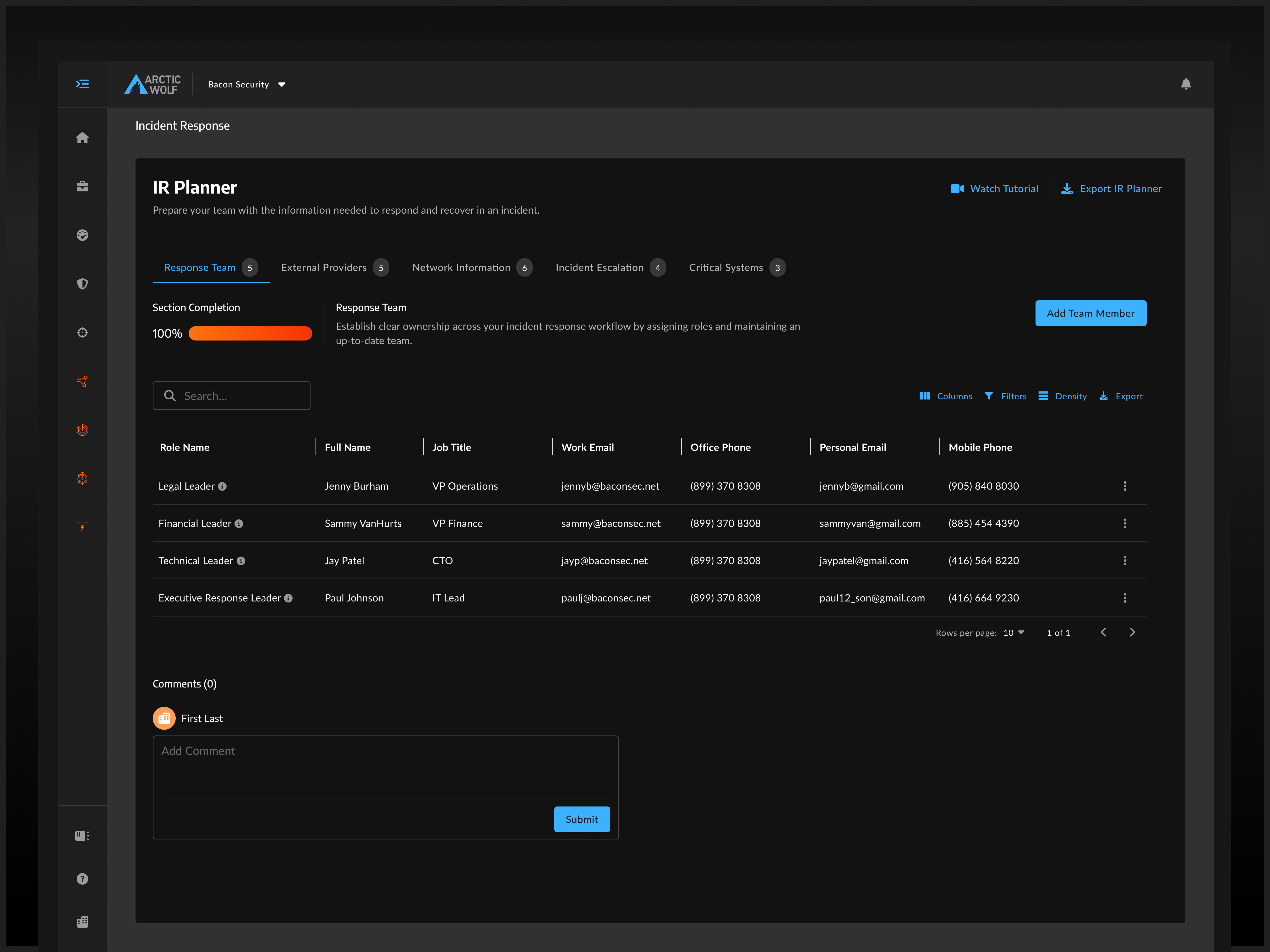
Every state across all five sections was specified to development-ready: empty and filled views, creation and save flows, edit and delete paths, confirmation and unsaved-changes dialogs, error and validation states, in both light and dark themes. A product that shipped with no design system and no accessibility checks now runs on Arctic Wolf's system with accessibility standards applied throughout.
TO FILL. Two baselines exist: the 30% completion figure and the pre-launch usability benchmark across all five sections. Lead with post-launch task performance against that benchmark if you have it. Otherwise: four months end to end, one designer, five sections specced to development-ready in both themes, shipped at feature parity ahead of the legacy portal sunset, with both baselines set as the measures to move.
Centralized contact management, connected to Arctic Wolf's customer directory. It is scoped for the phase after the migration, and it is the fix to the limitation I raised and documented inside V1's constraints.
Reflection
The plan only matters on the worst day. Most of this work was not about making incident response planning pleasant; it was about making sure the plan exists, and is correct, before anyone needs it.
The thing I would do differently is the contact proposal. Centralizing edits was the right instinct and Section 1 was the wrong home for it. A contact surface sitting outside the five sections would have answered the objection I did not anticipate.