Arctic Wolf was launching a new incident response product, Incident360 Retainers. The legacy platform had to evolve to carry self-service for a set of premium contractual benefits it had never been built to hold.
My role
I was Lead Product Designer, owning the end-to-end experience from technical discovery and research through to high-fidelity design. Inside a compressed three-month window, my job was to turn a complex new enterprise offering into a clear, production-ready customer-facing interface.
Three compounding failures in the legacy dashboard
- 01 No self-service option Routine requests were routed through CSMs and IR specialists, spending specialist time on scheduling and creating a bottleneck that would not survive scale.
- 02 High cognitive load in a crisis Dense formatting and no visual hierarchy failed users at exactly the moment clarity mattered most: an active security breach.
- 03 Bare-bones functionality The interface behaved like a static landing page rather than an operational workspace where customers could manage their security posture.
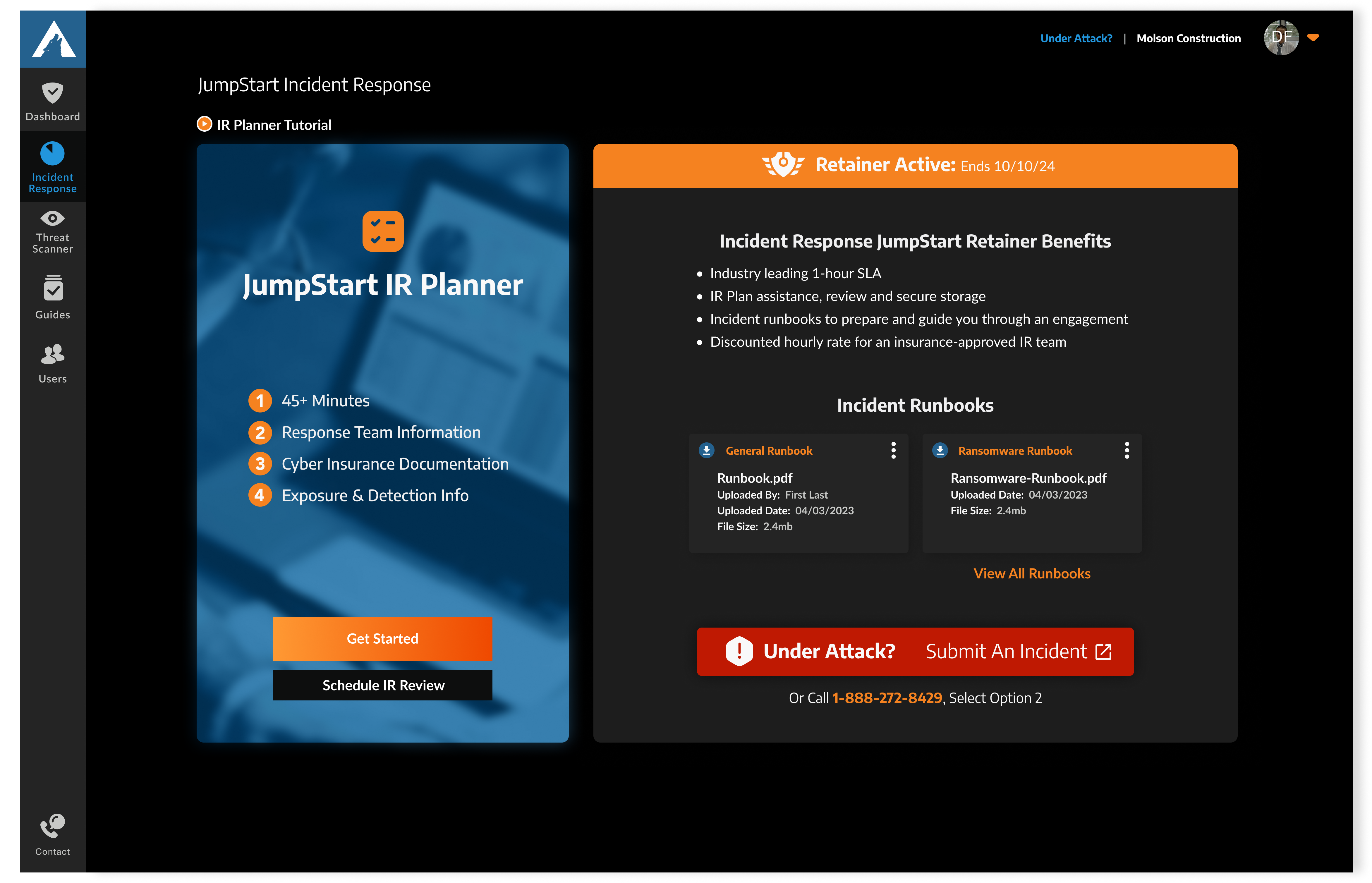
How I framed the challenge
Three pillars, each one tied to a distinct user state rather than a feature area.
- 01How might we guide users through incident readiness milestones?
- 02How might we let customers autonomously manage their retainer entitlements?
- 03How might we keep emergency escalation instantly accessible during an active breach?
- Goal 01
- Encourage customers to complete their IR Planners.
- Goal 02
- Allow customers to manage their retainer entitlements without a CSM.
- Goal 03
- Keep the dashboard navigable under high stress, including during an active breach.
From research and testing through development to post-launch QA. Less than one quarter, end to end.
The constraint that shaped every decision

The timeline meant I could not design in a vacuum. To understand the technical landscape, the data-tracking requirements, and the gap between what needed to surface and what was feasible to surface, I interviewed and worked directly with technical subject matter experts, Customer Success Managers, and product partners.
That produced a comprehensive system user flow, which aligned UX, product, and development by letting us stress-test the feasibility of requirements like submitting a breach threat and requesting a touchpoint review.
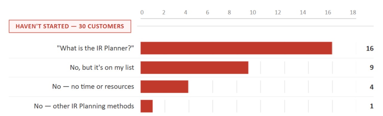
Reviewing past research surfaced the number that reframed one of our goals.
47% completion
More than half of surveyed IR customers had not started their plan at all.
An audit of the legacy dashboard explained part of it. The interface did not clearly communicate the state of the IR Plan, specifically whether it had been started, so customers had no signal telling them when to act.
Three layout directions
Before designing individual widgets I stepped back to the structure. The question was how information should be grouped so the dashboard could be read quickly, so I tested three distinct concepts against it.
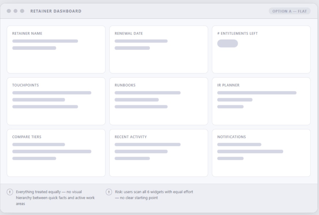
Flat equal-weight grid
A uniform grid with every widget the same size. Simple to build, but it removed hierarchy entirely, so the IR Planner sat at the same weight as the least critical data on the page.
Increased cognitive load. Does not support fast, high-priority decisions.
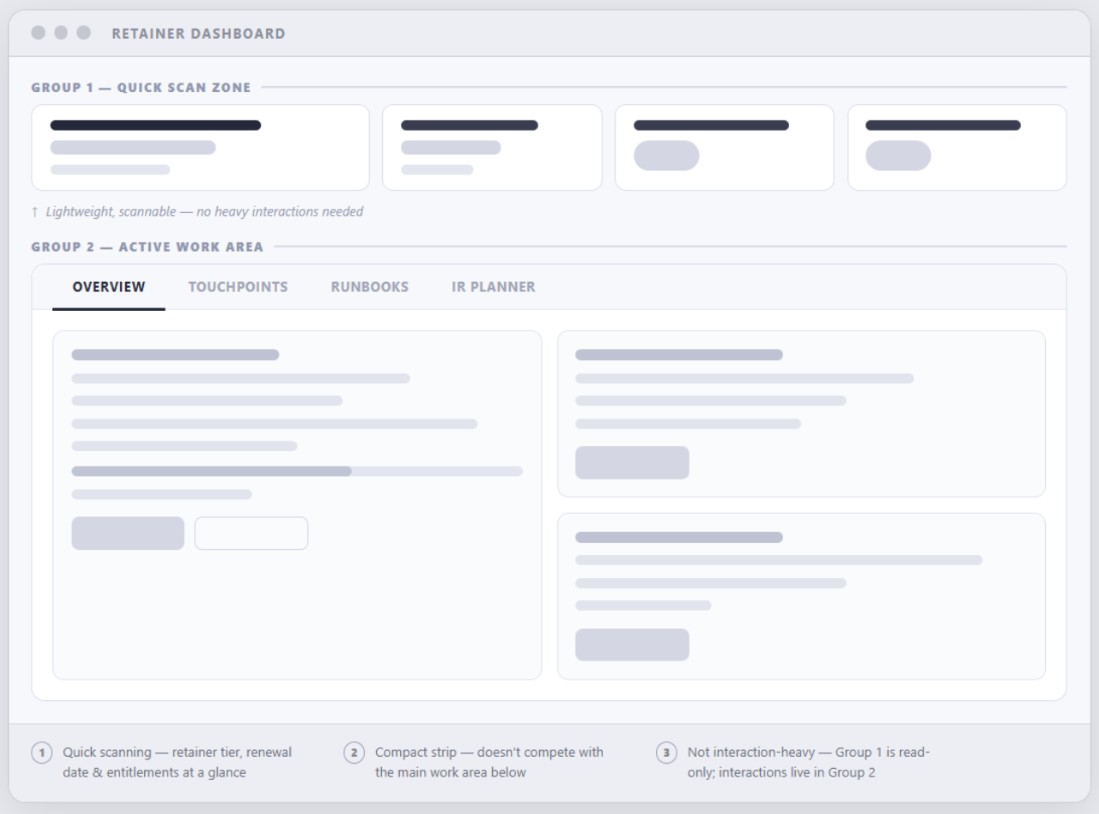
Tabbed navigation
Splitting the dashboard into separate tabs for runbooks and touchpoints gave each area room to scale, but hid critical information the moment a user switched away from it.
Tabs suit static data, not a monitoring surface that needs an always-visible overview.
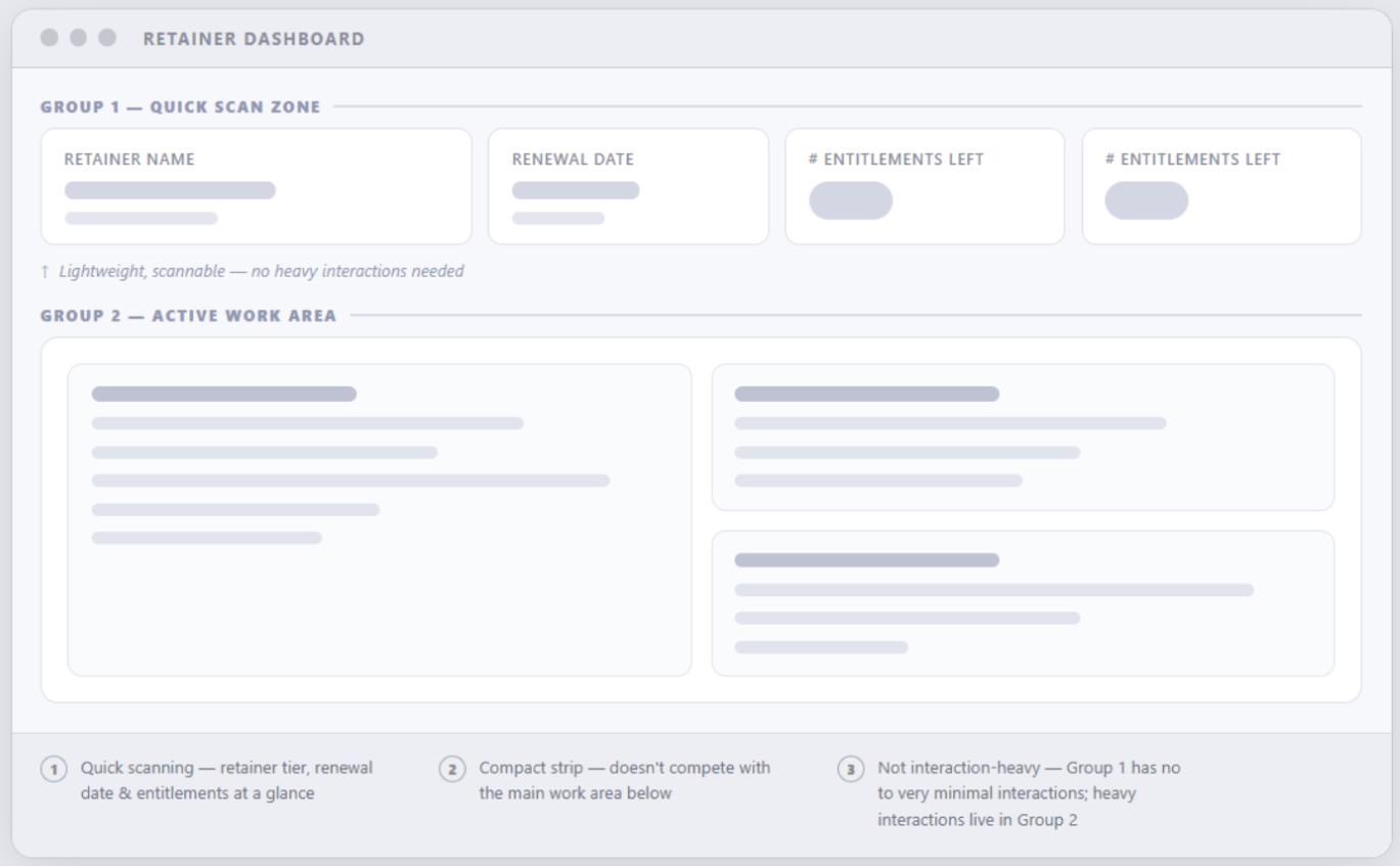
Overview and work area
A quick synthesis of retainer details sitting above the main work area in a single view. Key information stays visible at all times, and understanding status no longer requires navigating anywhere.
The only direction that delivered the clarity and hierarchy fast decisions require.
Two groups, two jobs
Feedback from Customer Success, product, and customers all pointed at the same need for a more intentional structure. The selected layout worked because it split the page along a real distinction: what people read, and what people do.
Group 1 — Quick, factual information
- Behaviour
- Users frequently log in only to validate what they purchased. Within seconds they need to answer a short mental checklist: what tier did I buy, when does it renew, and how many entitlements are left.
- Shipped
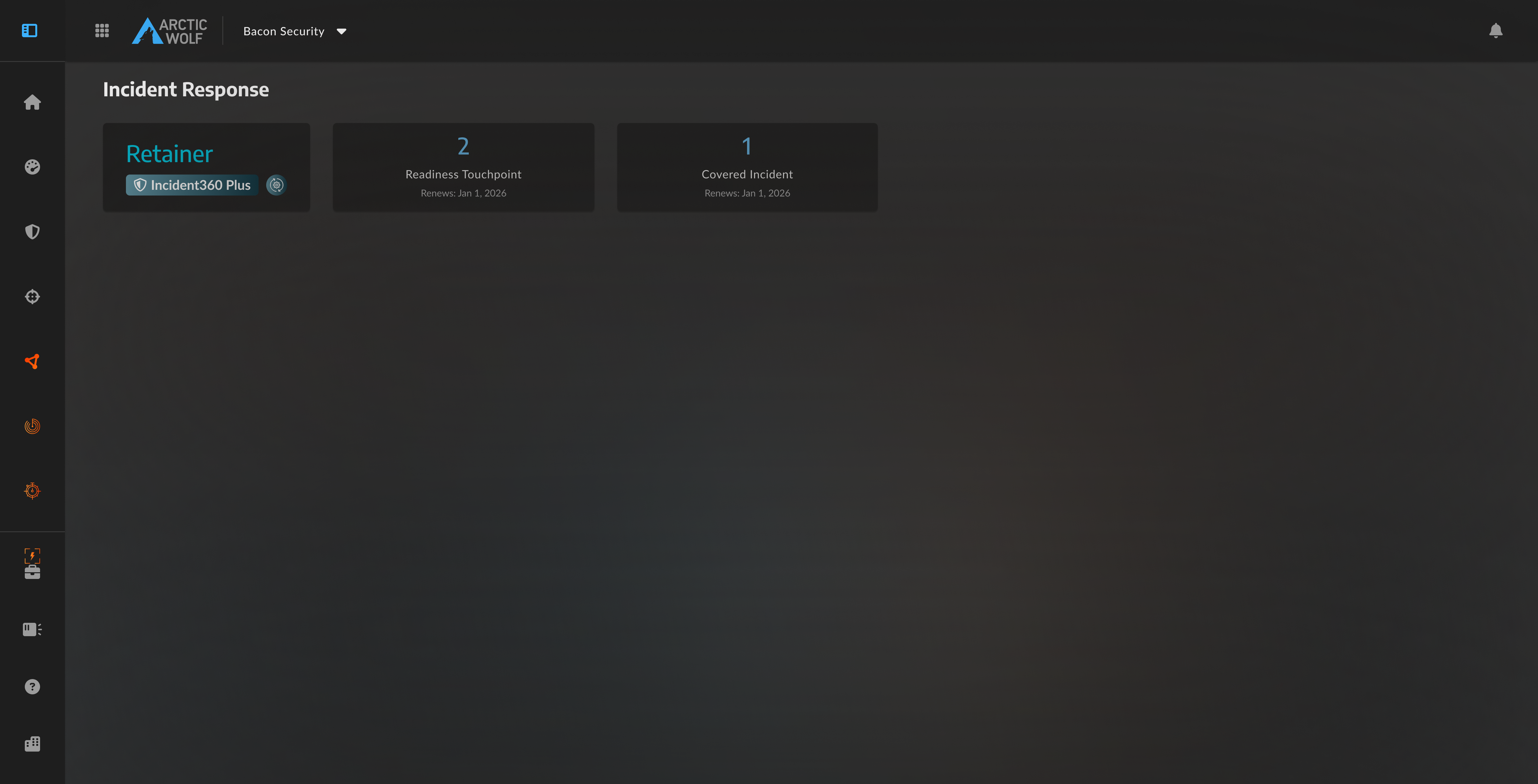
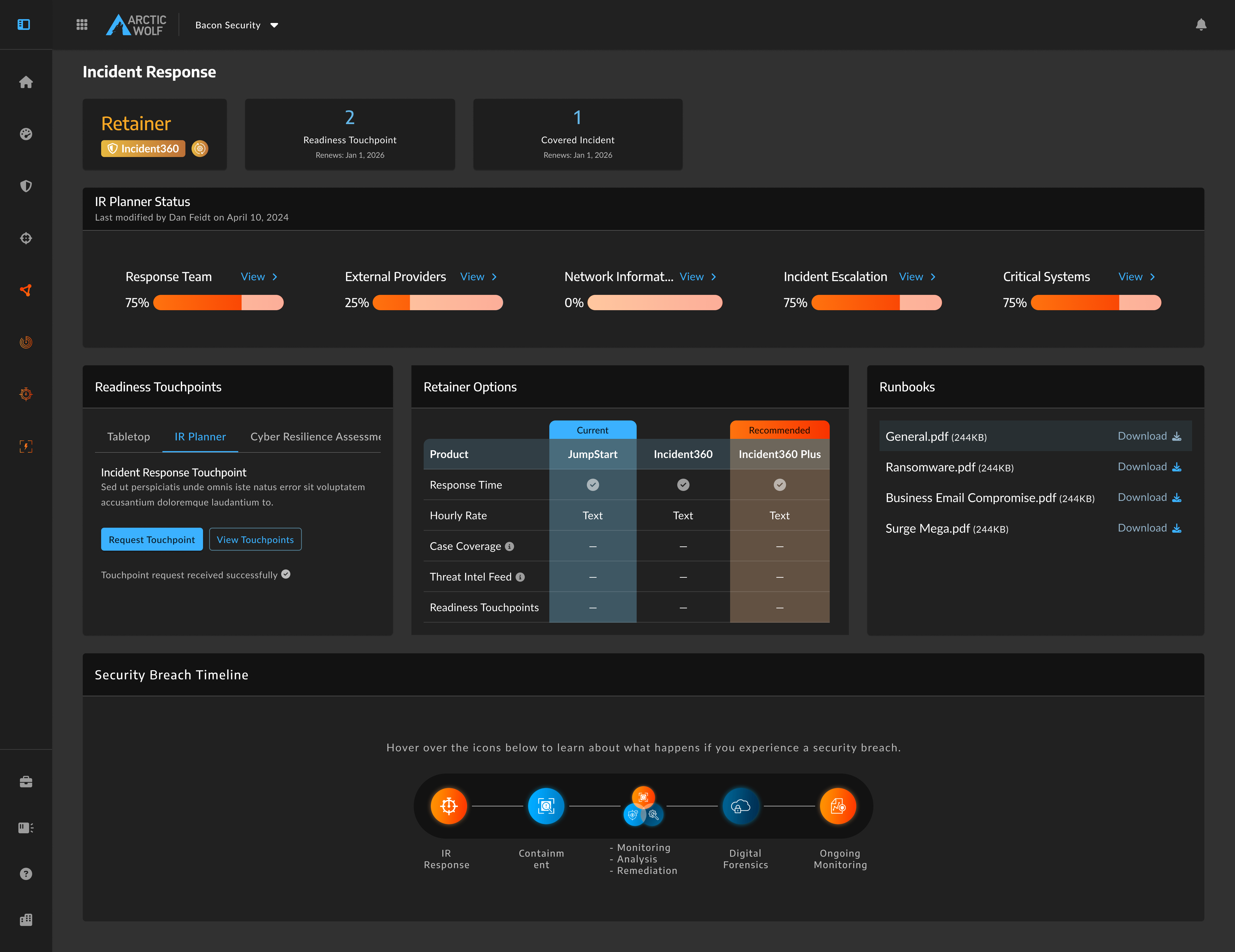
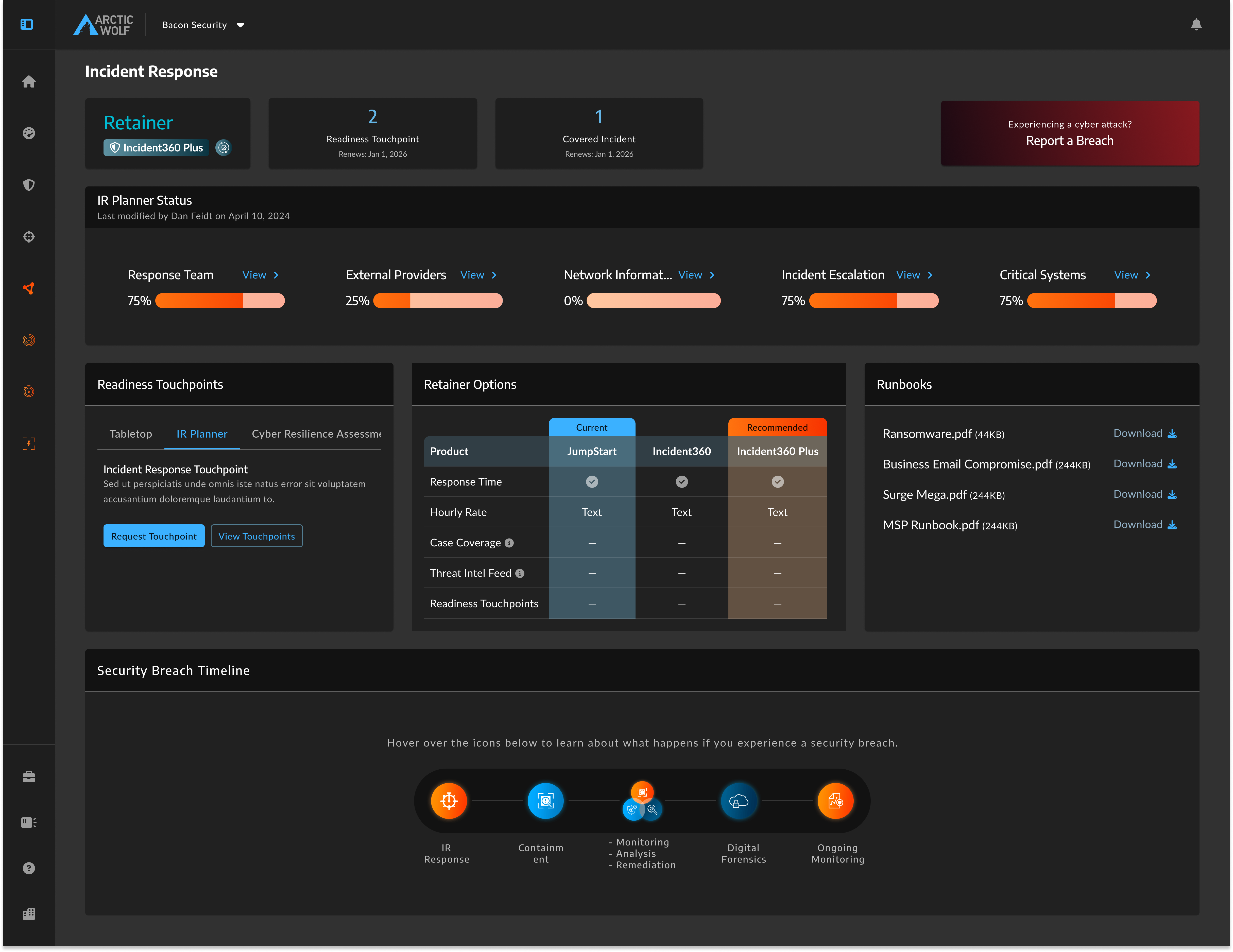
- A compact, scannable header row. Lightweight by design and intentionally free of complex interaction, showing the retainer name, available readiness touchpoints, covered cases, and renewal dates.
Group 2 — High-interaction work area
- Behaviour
- This is where customers actually work: requesting touchpoints, managing the account, downloading runbooks, comparing tiers, and tracking IR Planner progress.
- Shipped
- The bulk of the screen, grouped into a single action-focused area so interactive tasks sit together rather than being scattered across the page.
.png)
From architecture to action
With the macro layout settled, the next problem was the components that fill it. Three widgets carried the three framing questions, each placed in the zone that matched its job.
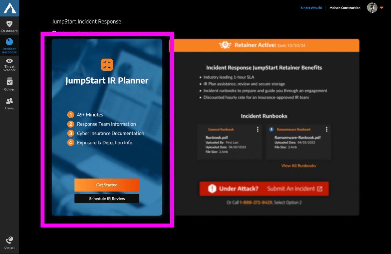
The IR Planner widget
- Problem
- The planner is critical to readiness, but engagement suffered from inertia. Customers who had not started needed an unmissable call to action; customers mid-plan needed a fast visual way to track progress so they would not stall out.
- Decided by
- The 47% completion figure, and the dashboard audit showing that plan state was never communicated.
- V1
- Surfaced granular sub-sections, breaking Response down into Legal, Technical and Financial leaders. Cut for two reasons: the density overwhelmed a confined widget, and sub-sections are not universally applicable when business sizes vary this much.
- Shipped
- A dedicated high-contrast unstarted state with a single START action routing into onboarding, and a started state showing core sections with simplified progress bars. Readiness becomes readable without making assumptions about how an organization is structured.


The touchpoint self-serve widget
- Problem
- Customers improve their posture through expert-led sessions, but this was a brand-new offering with no booking process at all. They needed to evaluate three touchpoint types, book without a support ticket, and see history from past sessions.
- Constraint
- Manual ticket submission was off the table from the business side. It would not scale, so self-serve had to work from day one.
- Shipped
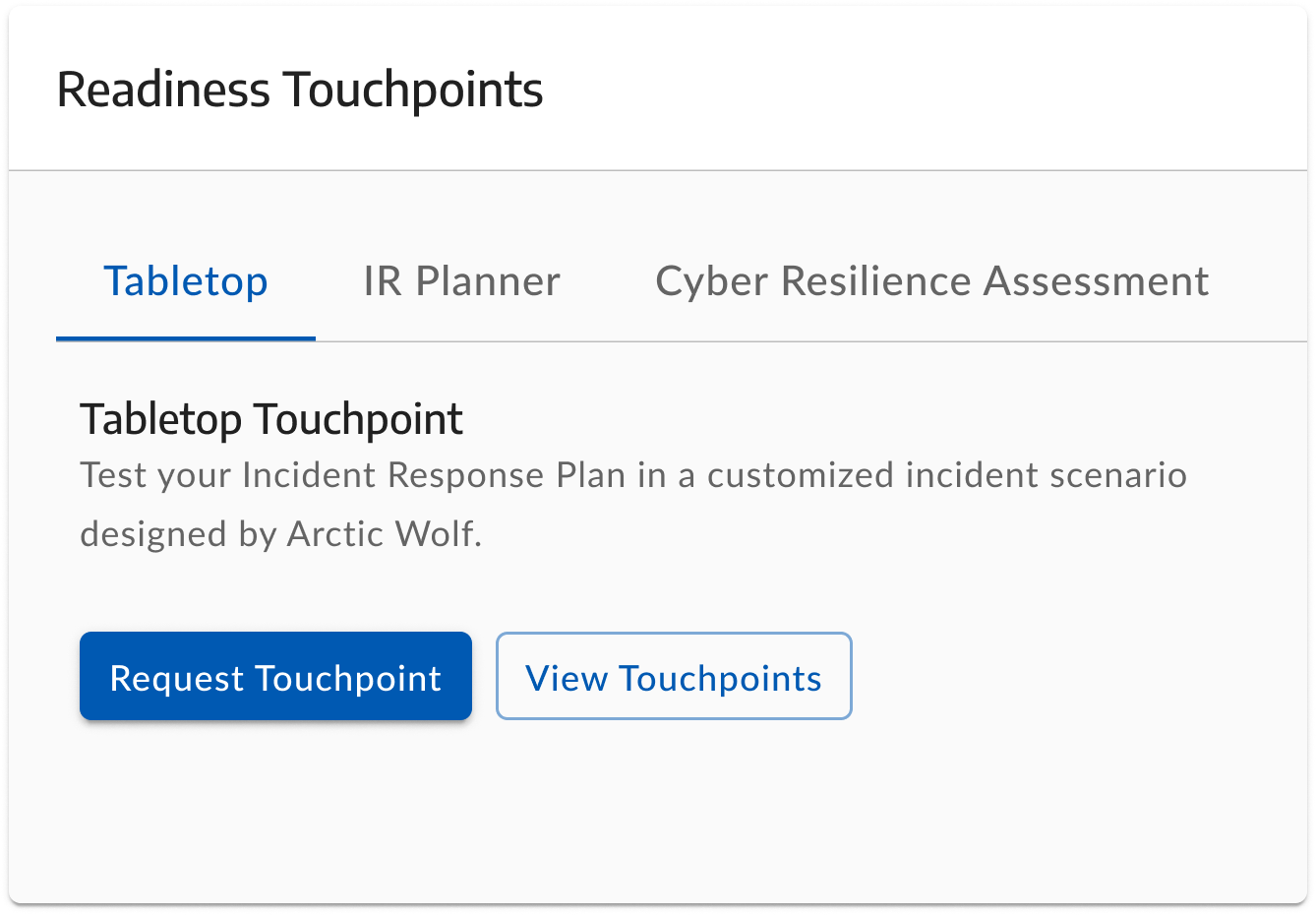
- A tabbed architecture, one touchpoint type per tab. Selecting a tab updates the body copy with the name and a short description, which removes the ambiguity that otherwise turns into support volume.
- Hierarchy
- Request Touchpoint as the high-contrast primary, which validates entitlement intent and moves the user into delivery. View Touchpoints as a lower-emphasis secondary for notes, documents and feedback from completed sessions.
The emergency “Report a Breach” widget
- Problem
- A customer under active attack is in a panic state. They need a literal emergency button: radically clear, findable within seconds, with zero room for searching through menus.
- Tension
- The action must demand attention when it matters, without dominating the screen every other day of the year. It represents a rare worst case.
- Shipped
- Placed in the Group 1 top row, where eye-tracking patterns show customers look first. Right-aligned to separate it from passive retainer data so it reads as a distinct high-priority action rather than another account stat.
- Why not bigger
- Deep red contrast and placement do the work instead of size. The element stays small, and the balance of the everyday workspace survives.
A unified experience
Pulled back, the spatial logic pays off. The goal was never to make the legacy dashboard look better. It was to give enterprise customers somewhere to work and manage their security posture without going through a person. A fragmented legacy interface became a cohesive, production-ready product built on the internal design system.
Revenue generated in the 12 months after launch, from zero at launch.
Incident360 and Incident360 Plus, excluding JumpStart
The Incident360 Retainer launch was a commercial success, with strong customer feedback on the new self-serve capabilities.
- Revenue
- Following launch in May 2025, the premium retainer tiers scaled from $0 to $9 million in generated revenue. Figures cover Incident360 and Incident360 Plus with the Rapid Response add-on, excluding the entry-level JumpStart tier.
- Validation
- A July 2025 IDC Market Note covered the product under the title “Arctic Wolf's Incident Response Retainer Plan: Why Didn't Anyone Think of This Before?”
- Named
- The report highlighted the redesigned dashboard directly, describing it as providing tools for incident response planning, cyber-resilience assessment, and insurability evaluation.
- Efficiency
- Centralizing these workflows into a self-serve surface met the stated goal of improving preparedness and response efficiency for midmarket organizations.
Protecting the scope
- What happened
- Moving fast in enterprise B2B requires ruthless prioritization. Aligning with engineering from day one gave me the confidence to cut features that would not scale, including a real-time status tracker. Pushing back on scope is what made the three-month target survivable.
Designing for the worst case
- What happened
- Designing for an active breach reinforced that the most effective UX is often the quietest. When someone is panicking, visual restraint and spatial clarity matter more than any interaction I could have added.
The short version
The dashboard's job was never to be looked at. It was to be used quickly, twice: once a month for a routine entitlement check, and once in a career on the worst day of someone's year. Most of the work went into making sure those two states never got in each other's way.